League of Legends
Battle Pass
Case Study
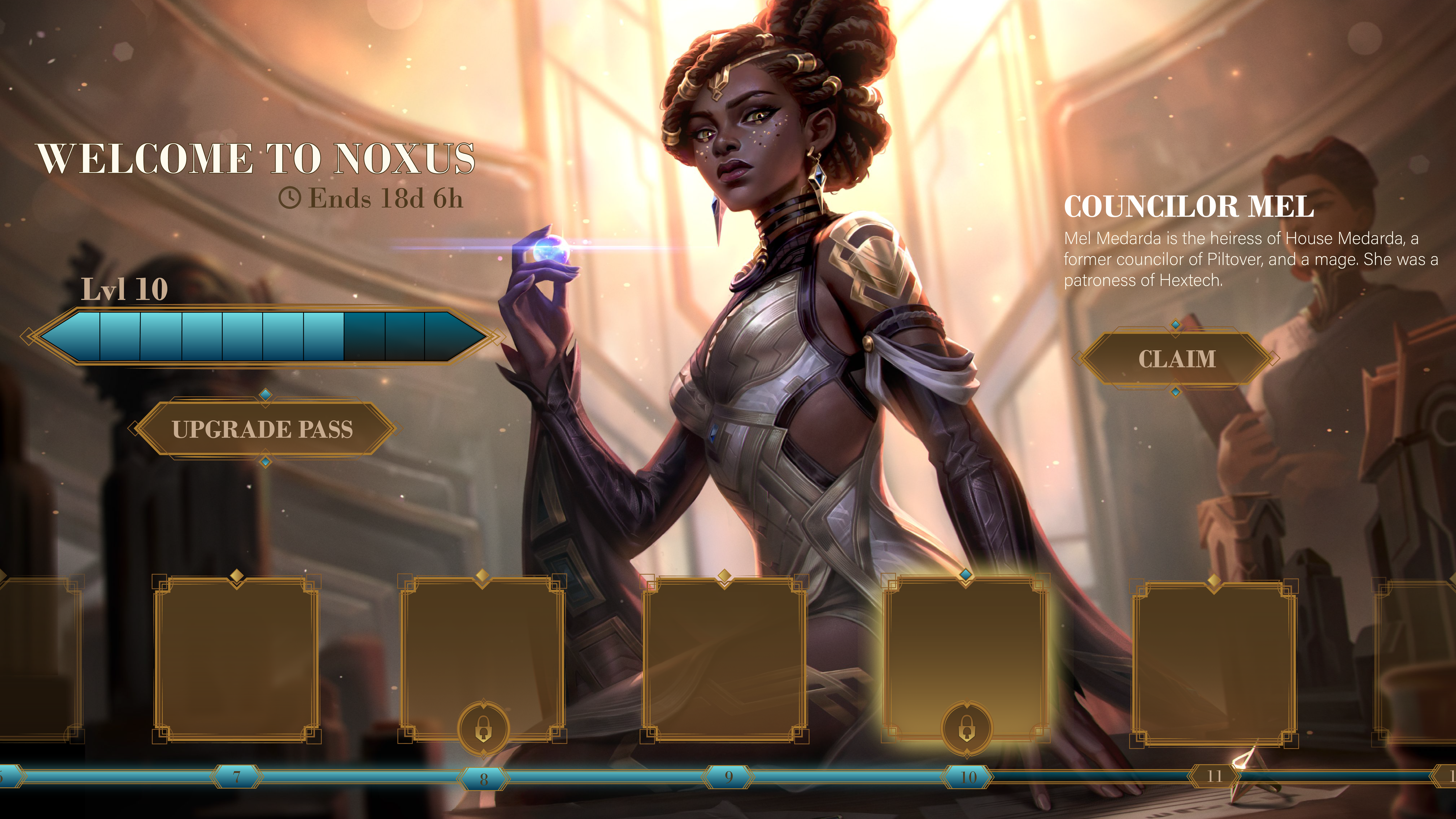
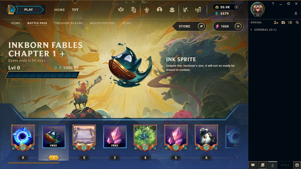
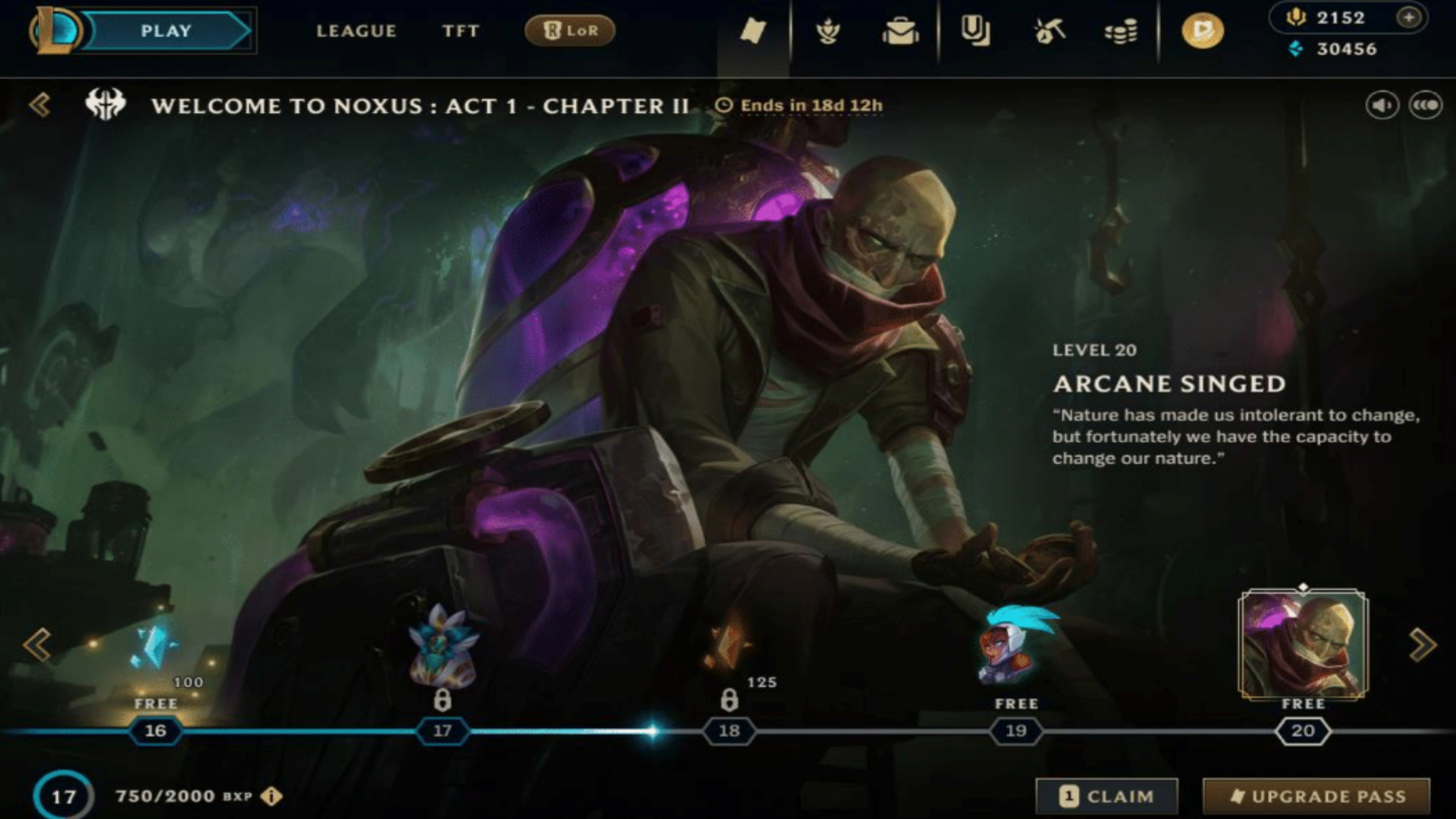
For this case study, I designed a battle pass screen for League of Legends, assuming it needed to display the same information as Team Fight Tactics. This includes the season name, time remaining in the season, a progress bar for the player's overall progress, a button to upgrade the pass, the reward's name and description, a claim button, and a reward track.
Visual Direction
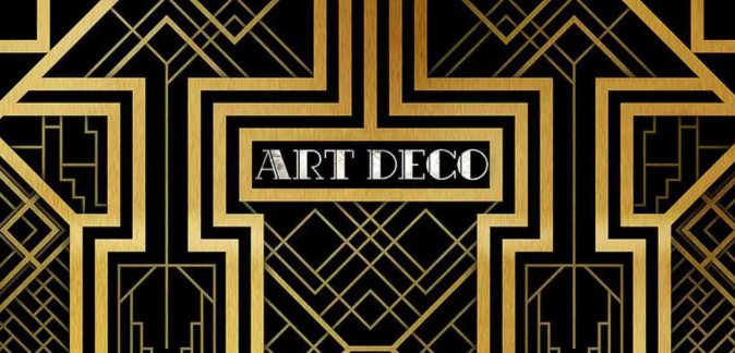
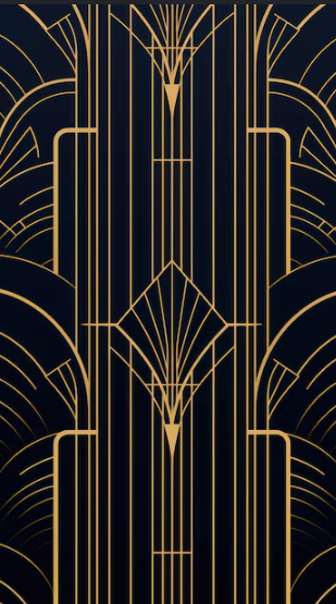
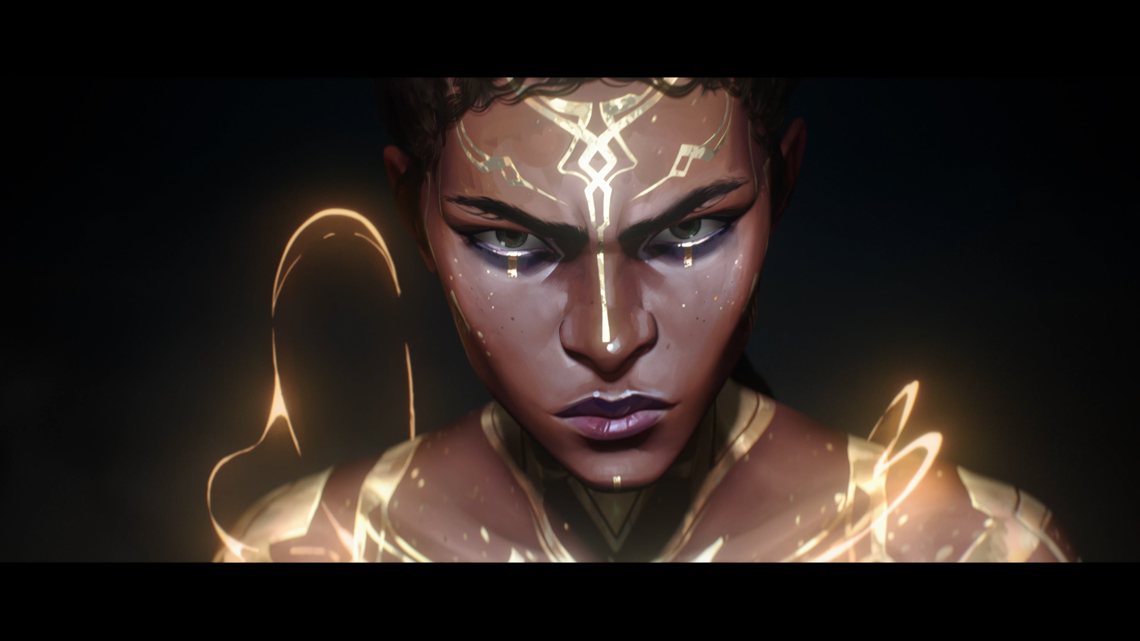
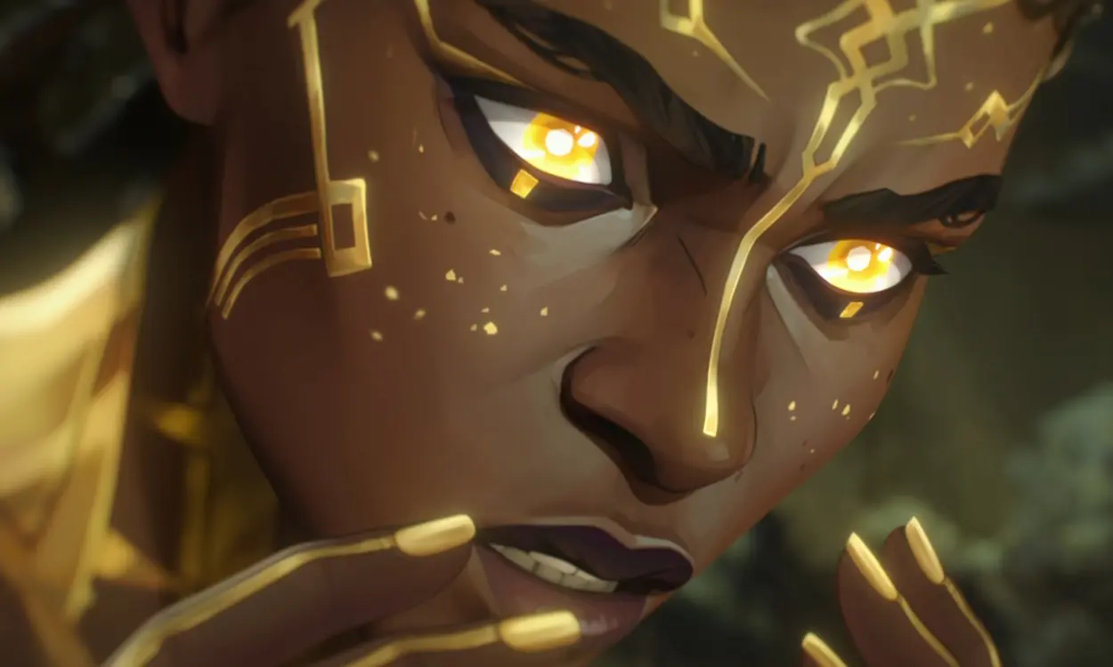
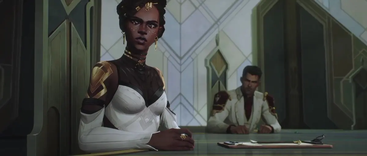
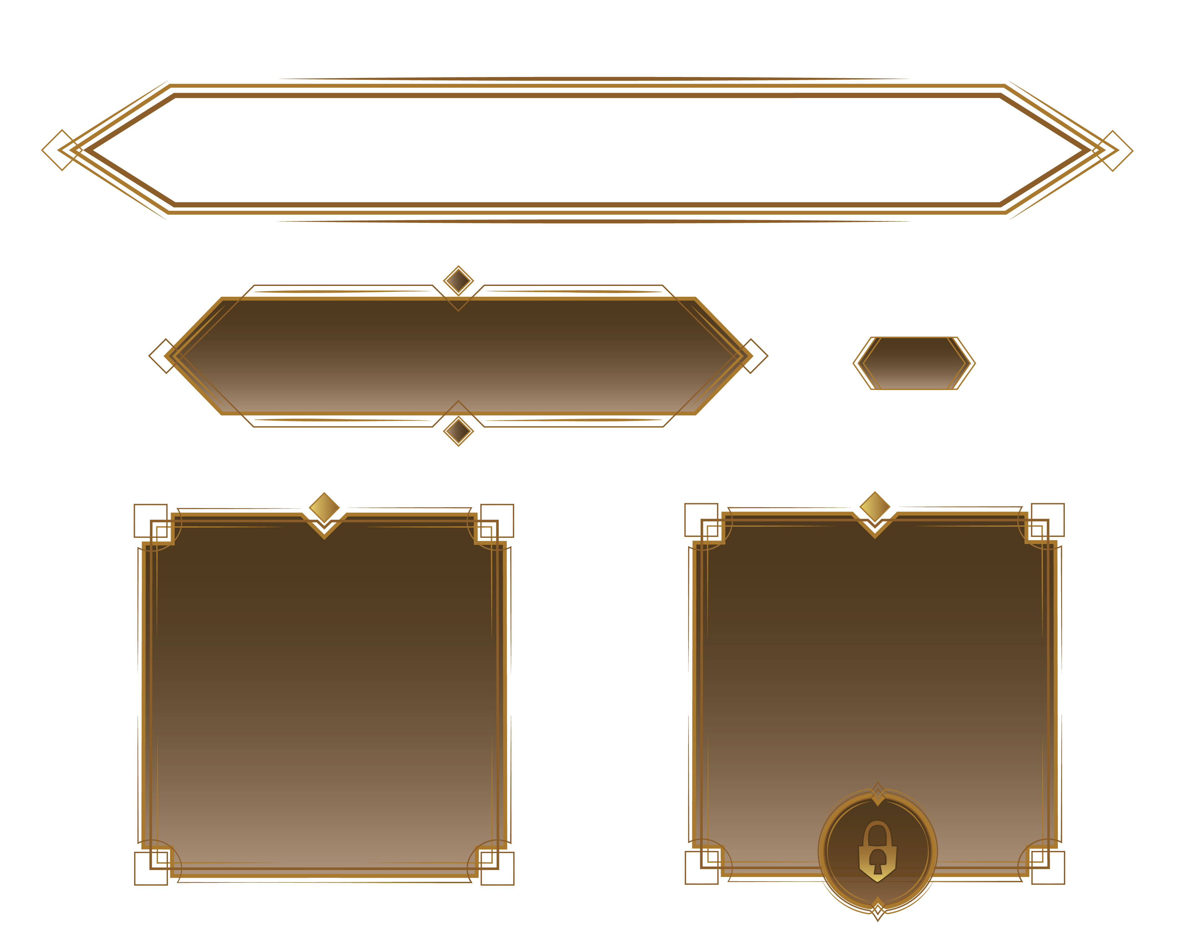
I drew inspiration from the visual direction and painterly art style of Arcane, especially the rich gold Art Deco elements seen in Mel's design and throughout Noxus. I incorporated straight, intersecting lines and geometric details to reflect that visual language and bring a sense of structure, elegance, and power to the UI while still keeping it consistent with the existing League of Legends style.
Art Direction: Existing League of Legends UI style mixed, Art Deco, Fantasy
Color Palette
Moodboard
Component Design
Final Design
For this Riot Games battle pass concept, I sourced the background image directly from official Riot promotional materials. After analyzing their existing UI patterns, I noticed Riot often avoids heavy borders around text elements, allowing background artwork to remain the primary focal point.
I attempted to follow this borderless approach, but encountered a layout challenge: the bright, high-contrast area on the right side of the composition made it difficult to position readable text while keeping it anchored within the darker regions of the image.
Solution: I added a subtle dark overlay with a Gaussian blur effect at approximately 20% opacity. This created sufficient contrast for legibility without heavily obscuring the background artwork, maintaining the visual hierarchy Riot typically employs.
High Fidelity Mockup